May 23, 2011
Phone Smart
The iPhone does a great job of displaying any website with its web browser and high-resolution display. With the easy touch controls, navigating just about any website is a breeze.
Still, personal user experience has led us to create smart phone versions of our web designs. Because really, a website that marries delight with function is sa-weet, but when accessed on a smartphone, the user pretty much wants one of a few things: a class schedule, contact info, driving directions … and fast. That’s why we designed Jen Spencer Coaches’ website (above) this way for the computer…
And this way for an iPhone.
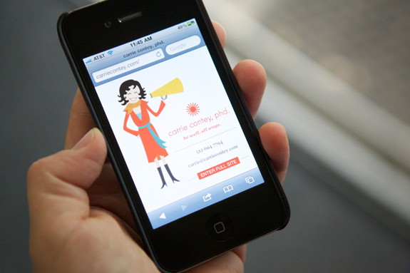
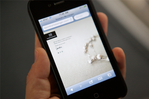
Websites developed specifically for smart phones are optimal because they utilize the screen to the fullest extent and allows the rare opportunity for an alternate expression of the brand. And that makes visiting our client’s sites especially tasty. Communicating to the world that our clients are accessible, thoughtful and (phone) smart is one way in which we take extra care.
Below are 2 more examples of our iPhone web interpretations for clients Carrie Contey, PhD. and Saundra Messinger.
:: If you liked this post, your next move would be to explore here. And if you loved this post… put us on your speed-dial. ::
Images: Chelsea Fullerton (dot com)


