December 31, 2011
One
Typical protocol for a Viewers Like You design project goes something like this: 3–5 directions presented in a 7-week schedule with, say, 4 rounds included. To retain the studio’s services we request a deposit (50%) upfront and follow up with our unconventional intake process, in which we creatively cull the needs of our clients. In response, we present a variety of design solutions from which they can choose, and the process goes deeper from there.
Sounds reasonable. But something isn’t right in this picture.
Giving multiple directions, well, sucks! Yup. Even giving 2 directions is painful most times, because really all that is needed is one good resolution. And really, that is why you hire a designer: to resolve a problem. That’s what we do. So while our design process is chock-full of directions, why do we offer multiple options to our clients? No, that is not a rhetorical question, I am legitimately asking, why?! I cannot begin to tell you how many times we have been disappointed by a client loving a perfectly good solution, but not the “best” one. And by “best” I mean the one we love best. And if your designer loves a direction THAT is the one you should want too. Because if you don’t trust your designer’s opinion implicitly, you picked the wrong designer. Yes. This is our dominion, expertise, passion, metier—what we have academically and professionally prepared for. And why, we trust, you were compelled to chose our studio in the first place.
No, design resolutions are not like children, they are not loved equally by their parents. Some are better than others, even if they all work/look/feel darn good. Yet, sometimes offering multiple directions honors the project’s needs and design process. In these scenarios multiple options are not an exercise in showing the client “Look, I am busy working hard for you!” Or, sometimes we can’t choose a direction that delights us more, resolves the challenges better, than another. In those cases we gladly design multiple options and enthusiastically go back into a dialogue with the client to root out more minutia. We love the minutia!
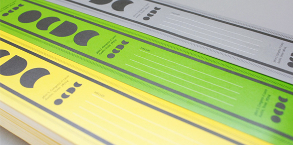
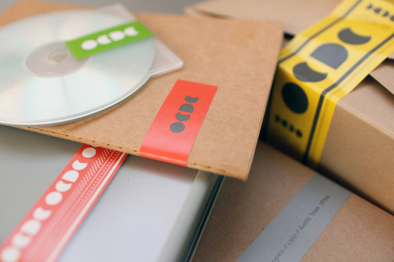
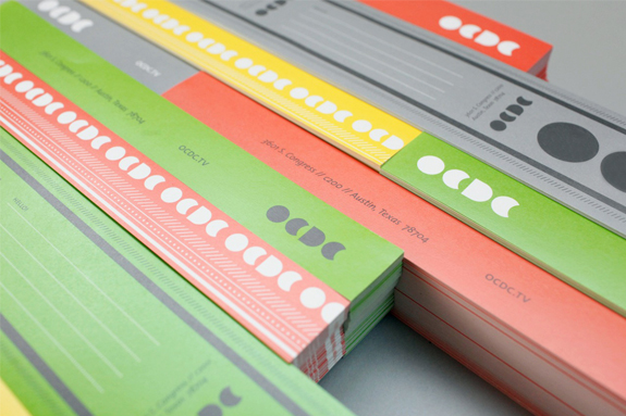
Not being able to choose a direction was the case with our client OCDC, but with a twist. When Keith and Shannon returned to us to resolve their packaging and stationary system, we were from go, gung-ho. A great client with a killer logo,—the brief was “You have creative freedom.” Cool. We proceeded with the usual multiple direction exploration, and when it came time to present round 1, we were torn. We did have a deep affection for one concept over the others, but any of the three would serve the project’s needs and not disappoint us if chosen. When Shannon and Keith picked the “wrong” direction we, without skipping a beat, went back to the drawing board to refine that concept. Like I said, we liked them all, it was a perfectly lovely direction, just not our favorite.
Fast forward 2 rounds, nearing the end of the production schedule, things always moving towards more clarity, and there is a pause. We’re really really sorry, but could we go back and explore that other direction, the “label” one?
You mean our favorite child? The versatile one, the one with the best personality and plays nice? Yes, yes we will gladly go and dote on it some more. Thank you.
Sure, a bit frustrating. But more so for us, illuminating. Why do we continue to offer multiple directions? Because of some notion we have about a standard protocol? To make sure our clients feel like they are getting a good value? To show we are really good worker bees? The question should be: what is the best design practice and how do we best serve our clients? All signs are directing us to “one”.
So while our studio moves to a system where it is understood that we are being commissioned to create one (appropriate, inspired, subversive, brilliant, strategic) resolution, we will continue to meet each project as an opportunity not only to fulfill a need but to rethink how it is we are engaging with our clients and the work. Coming to a place where we can purify the act(ions) of being a designer even further.
:: If you liked this post, your next move would be to explore here. And if you loved this post let’s purify this thing—the client/designer relationship! ::
Images: Chelsea Fullerton (dot com)

