February 11, 2015
Mind your posture
One of the projects I fully engaged in, was the design and production of a gut renovation for our new home. Like any other client project the balance between what something costs and its value is paramount: Where do we invest more than we expected and where can we go more off-the-shelf? What contrast of high and low will raise everything up? I’m thinking specifically about the “more than expected” handmade pendant we chose for our living space. It’s loverly.
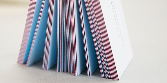
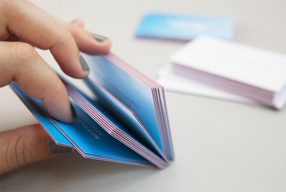
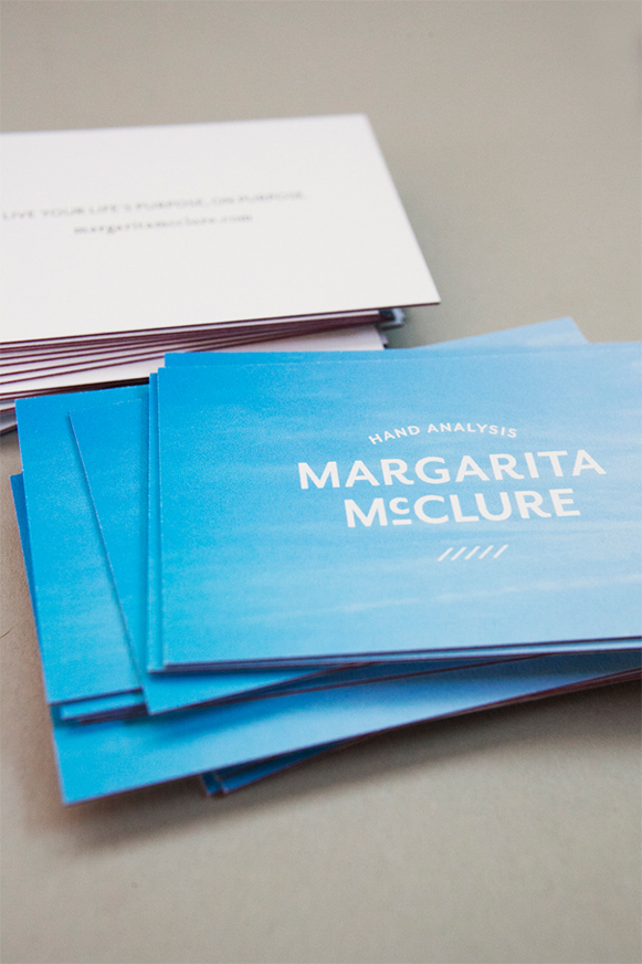
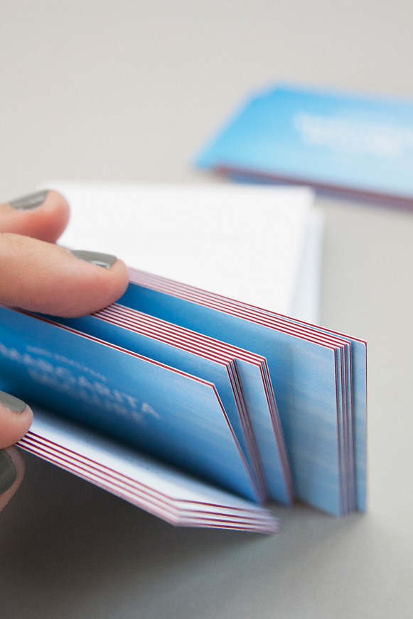
The same holds true for these business cards created for Margarita McClure. They’re dreamy, right? Triple-thick with a seam of color. Premium Mohawk Superfine stock. And while the photos capture how incredible the cards look, they transcend that, and literally feel different. Which makes the world of difference for our client when passing one to her potential clients.
The extra investment required was worth it not only because the card is impressive to the receiver, but because the act of handing it out inspires a new posture from the giver. THAT is the point-of-difference of placing oneself at the crossroad of premium cost and value. You get taller when you stand up straight. You have more energy. You are slimmer-looking. Really.
For those who have read my $300 bathing suit post, you know that that intersection is not only where I encourage my clients to reside, but where I, too, choose to live. It’s loverly.


