April 17, 2013
Design to drool over
What makes something a design triumph? There are a plethora of respected, annual design competitions—the one’s that can fill you with envy—that show a year’s best graphic design, and usually narrowly focused only on aesthetics. But there is only one heavy hitter annual who’s criteria considers how design creates value for clients.
THIS is one of THOSE projects that could be entered into THAT.
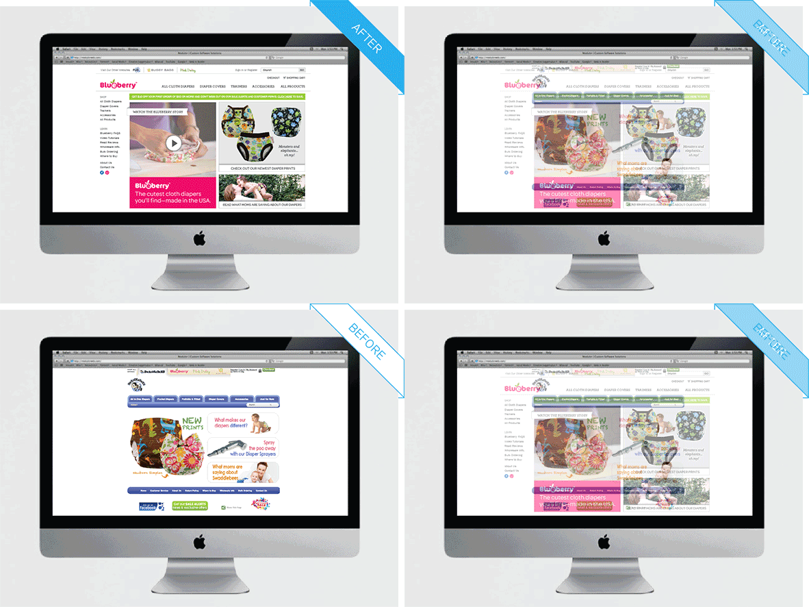
The Blueberry website re-design challenge was massive, and seemingly endless. The layers rivaled an onion. With each peeling back causing more tears.
But the biggest restriction for our studio was to find a work-around to a design-unfriendly backend platform. This was the one non-negotiable. The software worked brilliantly for our client’s accounting, inventory, and shipping needs—but no so much for their end-user’s ease and delight. That’s where we come in. To push the management system’s esthetic and navigation edges while retaining the capabilities our client needed.
A year later, all the extensive subtle shifts have resulted in Blueberry customers understanding the differences between many product offerings, navigating confidently from arrival to checkout in fewer clicks, as well as being welcomed to the site with a charming “about us” video.
Creating value for clients, and our client’s clients, is a design triumph. And this is the show that really matters. Design that works is Design to drool over.

And how cute is this redirect?!