February 01, 2013
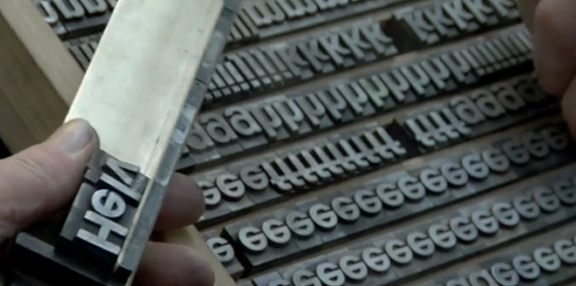
HELLvetica
I have strong opinions about seemingly small things—for example, a hotel’s choice of amenities is a BIG deal to me. However I am also quite nimble about my attachement to these opinions, which can be confusing. If your counter-reasoning makes sense, then alrighty, you’ve influenced a new opinion of mine. And thank you.
IF you make good sense.
Let’s take Helvetica. The typeface. I pretty much hate it. If it wasn’t for David schooling me on the merits of the face, then that first sentence would read I really, really hate Helvetica.
David looks at Helvetica from a historic, formal perspective. And he makes a really compelling case for the typeface’s merits (more on that below). I consider Helvetica based on its application. Its pervasive application. And unless you are intentionally constructing a Swiss grid—choosing to use this face makes me sad. And angry. But mostly sad. Sangry.
Yes, there are examples of graphic design using Helvetica that I like. This has more to do with the quality of how the designer used the face—and usually only when Helvetica is used as display type.
But I still judge it harshly.
Not that it’s necessary, but I have backup on my opinion. Check this out:
“As a text typeface Helvetica is an awkward creature. It is only because it is available on all computers that it is used by so many people around the world. You cannot blame them – they have no typographic education. They just have to set some text in some typeface. Unfortunately, Helvetica is about the worst choice one can make for text. Paul Rand, the American graphic designer, advised his students to use Helvetica only as a display face, and never in text, ‘because Helvetica looks like dogshit in text’.” (Martin Majoor, “Inclined to be dull,” Eye, No.63, Spring 2007.)
Did ya catch that? Inclined to be dull. Not neutral: dull! The full article is great and can be found here. It also mentions two of my preferred “Helvetica-like” faces: Bau and Akzidenz Grotesk.
Yes, this is where it gets tricky, I distain Helvetica yet love me a Grotesk. Which is just a fancy (German) word for sans serif. When choosing a typeface for Viewers Like You, in print we picked a precursor to Helvetica, Akzidenz. For our site we chose a contemporary drawing of a Grotesk that was well suited for the web, Bau.
That schooling I mentioned from David? It goes like this:
Because of Helvetica’s uniformity, it often is misinterpreted as being neutral. But there is no such thing as neutrality in anything, much less a typeface—that’s a Modernist bugaboo.
What makes Helvetica successful in display, demands a lot of a reader when set in running text. Sans Serifs are tedious and tiring to the eye when used in a large, geometric copy blocks (think the body of a letter or a blog post).
Helvetica isn’t a bad typeface, it’s a solid mid-century neo-grotesk that is too often used incorrectly.
So there you are. Oh, poor misunderstoodused, helpless Helvetica.
With Webfonts + TypeKit we have unprecedented access to many Grotesk faces that excel on the web. Greater readably and comprehension plus the benefit of not being associated with all the terrible, unthoughtful applications of Helvetica work in our client’s favor. Until the time I am convinced otherwise, there is truly no compelling reason to use what is literally a default face.
Just say no.
To keep this post PG-13, I spared you my rage towards Helvetica Neue. But for some spicy Helvetica distain, this commentary by Armin Vit goes there. Scroll down past the logo review for a tart and smart take, that I wish I spoke first.
::
I do, however, highly recommend the documentary Helvetica.