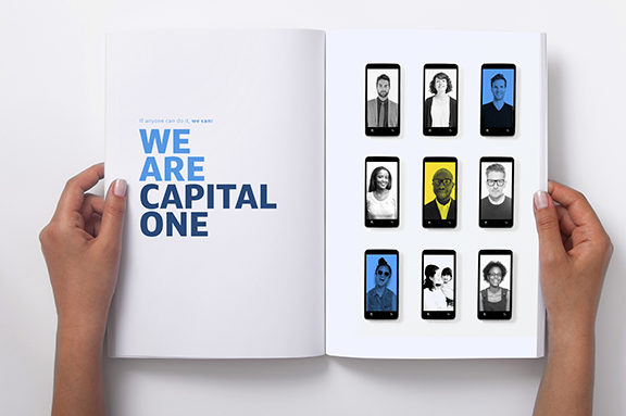
I took a gig, in-house, as an Art Director at Capital One. I know! The opportunity came out of left field and I was game to see what was up. Before the meeting, I was adamant that although I was open to a conversation I wasn’t going in-house. Ha! The moment I met with Rex McCubbin, my soon-to-be Creative Director (I KNOW!), all that vim and vigor went out the window. I wanted in. The team she leads is called One Brand Enterprise. 16 of us are charged with conceiving and creating brand standards for all Capital One lines of business. We establish creative direction, stylistic choices and develop the tools other Art Directors, Designers, Photographers, and Writers use. Turning work over to other designers is an interesting exercise of being healthily detached, and supports my commitment to executing clarity + delight.
Projects will be added as I feel proud, and time is made to showcase:
Quicksilver Ad Campaign
Pro Bono Program – 20th Anniversary
________________________________
Quicksilver Ad Campaign
REPOSITIONING QUICKSILVER
With the ever-growing portfolio of digital tools developed to support Capital One cardholders, came the need to reposition their premier cash-back card: Quicksilver. Once upon a time, Quicksilver’s 1.5% cash-back was news, now other cards offer up to 5% back. Competing in this arena is not Quicksilver’s strength. Instead, Quicksilver distinguishes itself by privileging the needs of consumers in the digital era. They do this via three digital tools: If you misplace or lose your card—Card Lock. If you want to track your spending in real time—Instant Purchase Notifications. If you wish you had a second set of eyes double checking your purchases for costly mistakes—Second Look.
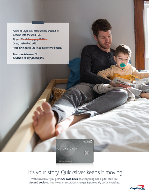
My task: Establish a new tone, look, and vibe for Quicksilver. I was one of 4 art directors on the case, sharing 1 copywriter. We set out to solve “print,” keeping in mind how it would roll out to social, direct and mass.
↑
Creative Strategy
BEYOND THE SWIPE
Copy: Matthew Strange
There’s no way around it. Life requires spending money. And let’s be honest—you’re already pretty smart about it. Every money decision you make has a reason (or three) behind it. But you still might wonder, did I make the right call? Is this really the best deal? Did I spend enough time researching? Because right now your credit card is just that—a card. A piece of plastic that allows you to make a purchase. But what if it could support you beyond the swipe? What if it could remove some of the doubt that comes with managing your money? What if it could empower you along your shopping journey? Meet Quicksilver, the card that helps you spend with confidence before, during and after you make a purchase. Quicksilver delivers elegantly simple solutions for the way you live now, with cash back and a variety of digital tools that help you to save time and money. So you can eliminate all of those nagging “what ifs?” and feel confident knowing you’ve got the card crafted to meet you where you are in life.
↑
Creative Positioning
GO BE AWESOME
Copy: Matthew Strange
If you’re waiting for us to tell you that this card will make all your dreams come true, we’ll cut right to the chase—it won’t. Yes, you’ll earn 2% cash back on every purchase, every day. And yes, you’ll earn unlimited cash back—so the rewards will really add up. But, you’re the one who’s in charge of your life. You’re the one who’s going to go back to school, try your hand at painting, buy a house, finally run a marathon, get that promotion or start a family. (Congrats, by the way). What the Quicksilver Plus card is here to do is make things easier along the way. If you lose your card, boom—card lock. Want to track your credit score—CreditWise. Wish you could’ve gotten a better deal on that hotel you booked last week—Paribus. We can’t make your dreams come true. But we can give you more control over your finances. We can save you from the stress and hassle of identity theft. And we can definitely save you some money and earn you cash back. So, yeah… go be awesome.
↑
My Pitch
IT’S YOUR STORY
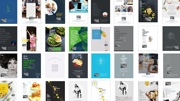
We skim. We communicate in tweets. We want short, easily consumed content. And while this might be true in some cases. It’s not for people who want to buy. People who are interested in your product or brand want to know more. Brevity is not a treasured tool of the salesperson, so it shouldn’t play such a prominent role in modern advertising approaches.
My pitch was to lead with a copy-dense direction. With long copy, a brand can increase trust, break down the viewer’s objections, and provide them with a better understanding of the product or solution. It’ll gives Capital One/Quicksilver a chance to tell a more complete story, and in the process, more thoroughly convince the reader that our brand is the best brand.
The main objective was to maximize the impact of every word and phrase—as people do not read bad copy, irrelevant copy, and plain boring copy—BUT! they’re willing to read long ads with a lot of text if it’s engrossing.
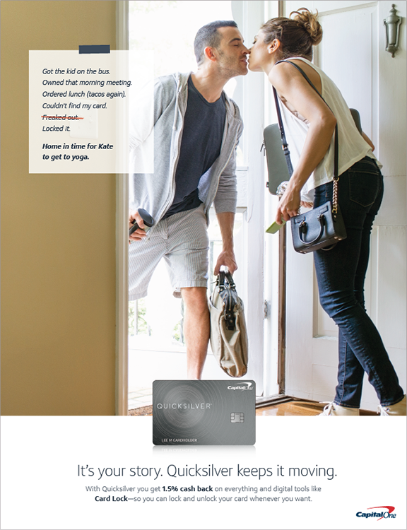
And while the original direction, with lots o’copy was chosen (second from left, top row, above), as these things do, it was quickly replaced with bite-sized sentences.
↑
After the pitch
THE SECOND WALL
Design: Mackenzie Taylor
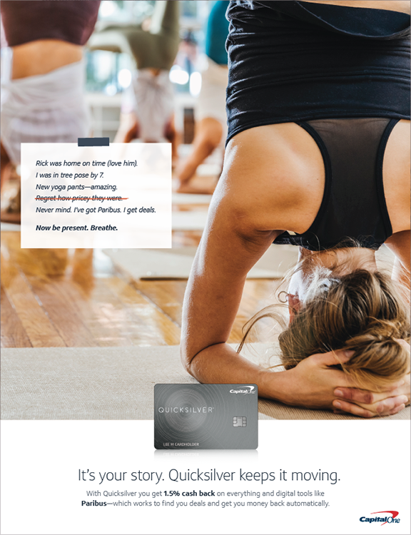
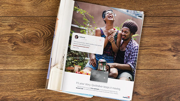
Inevitably, after a direction is chosen, the next act is solving a myriad of client challenges. “We love it” now can you make it do this, and this, OH! and this. Ha. On my team, this is called breaking through the second wall. In round one we solved for the challenge of legibility of handwritten note, but typing out the list and keeping a hand-drawn strikethrough. However, while now legible, a typeset stickie note moved us farther away from it being someone’s story. It’s an affectation, false. So how to retain a person’s authorship AND be able to communicate the copy, without any friction.
The move from a taped note to a stylized social media post not only satisfied the overarching need for readability, but added relevance to the “moments of life’s momentum” photography. SIDE NOTE: Yes, the propensity of lifestyle photography in advertising is an affectation. Manufacturing authenticity is an oxymoron. And has been co-opted and used ad nauseum. At this juncture, the brand was not willing to establish a new photo style, and while its pervasiveness will render it meaningless soon enough, for now, the style resonates with Quicksilver’s ultimate consumer target: Upmarket Heavy Spenders.
Taking my visual and conceptual lead, Mackenzie brought the concept over the finish line.
↑
Delivery
BRAND STANDARDS
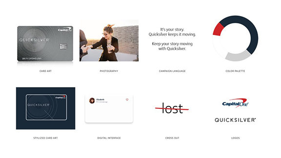
The vehicle used to release control over all the work done to reimagine Quicksilver, comes in the form of a Playbook. A collection of elements, and their context, allows others to bring Quicksilver’s new vibe to life as intended.
While developing Brand Standards for clients is not new to me, giving them to an individual, is decidedly different than hand them over in a corporate environment, to a band of others. The line from my intention and how a client realizes their brand is a short one. Usually, it stays in view. But this project’s trajectory has many junctions and some destinations will be unknown. Bringing an added importance to the document.
↑
________________________________
Autonomy and freedom of choice are critical to our well being, and choice is critical to freedom and autonomy. Nonetheless, though modern Americans have more choice than any group of people ever has before, and thus, presumably, more freedom and autonomy, we don’t seem to be benefiting from it psychologically.
— The Paradox of Choice, by Barry Schwartz, 2004
Pro Bono Program – 20th Anniversary
CONCEPT STATEMENT
Writer/Director: Elizabeth Blumer
This year, the Brand Pro Bono Program is celebrating 20 years of giving back to the community. We could tell everyone about all the great things we’ve done, all the people we’ve helped — but what better way to quantify that than giving people the cold, hard facts? We’ll use dynamic type and snappy cuts to present irrefutable stats that chronicle the Brand Pro Bono Program and the tremendous impact it’s had over the past 20 years, on both our community and our associates. The facts will cover both the tactile and the intangible, like the 427 partners we’ve served, the 7.3 million dollars worth of marketing services we’ve donated, the 137,000 smiles we’ve shared, and the 8 million warm fuzzy feelings we’ve generated.
We’ll also touch on the different kinds of people from Brand who’ve taken part to show that everyone has a worthy skill to donate. It’s fun, easily digestible, and sure to inspire associates to learn more about the program.
PROJECT BRIEF
The program has evolved over the years, and is now a beacon for skills-based volunteer efforts within Capital One. We have been steadily increasing the types of projects offered and the number of Brand associates involved, but we still face participation barriers. We believe that by telling the stories of Brand associates who have been involved in Pro Bono projects, and of the impact of that work, we can help drive more Brand associates to get engaged in Pro Bono volunteerism.Our objective is to educate Brand Associates about the Brand Pro Bono program and inspire them to seek out more information from the Pro Bono Pulse page and volunteer. We want Associates’ takeaways to be: 1. Pro Bono work does not take as much time or effort as you think, 2. You’ll use your skills to help other, 3. The experience will leave you feeling more fulfilled at work and can help your professional development, and 4. After watching the video, feel inspired to volunteer with the Pro Bono program.
↑
My process and perspective
QUID PRO QUO FOR PRO BONO
While I’m always keen to use a new typeface and take it for a spin, at the same time the sheer number of appropriate choices vying for my attention is a sure way to create analysis paralysis. Working with Capital One’s singular, proprietary typeface—Optimist—eliminates the need to scrutinize a vast library of choices available. The decision is made. And for this I’m grateful. Designing within this constraint, 1. Puts to test Optimist’s potential and 2. Exercises my resourcefulness. I’m happy with the exchange of freedom of (typeface) choice and freedom to explore (a typeface’s range). It’s thinking within the box, if you will.
My task: Create the box for the Brand Video Team’s After Effects Designer to work within. The final video includes my type design part and parcel, and in a few instances illustrates its influence on type treatments I didn’t execute. This project afforded a unique opportunity to push my and Optimist’s edges, through video’s inherent use of kinetic type.
↑
↑